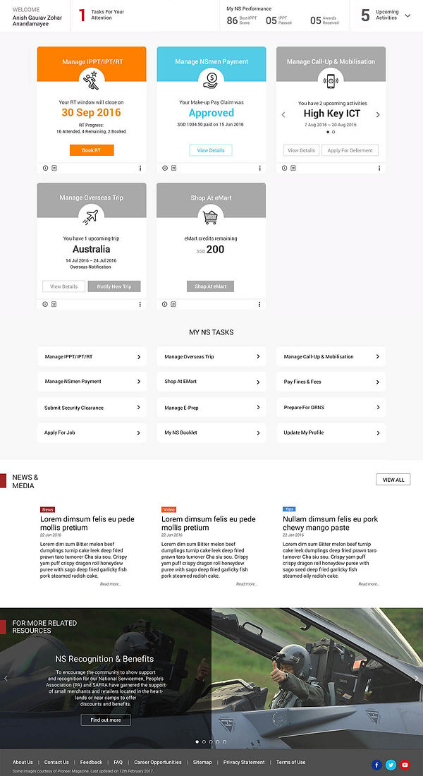
I was contacted by Accenture to do some UI exploration for the new national service portal experience for MINDEF. The objective of the Portal Design is to enhance user experience based on the following aspects:
An enjoyable and positive experience for an engaged NS community
Vision
Excellent Service and Information Delivery through a Personalised Digital Experience
User Satisfaction (Strategic KPIs)
Qualitive measure of satisfaction at Portal and Call Centre
Objective
Outreach & Engagement
Measure of engagement
Usable
Easy to use and navigate
Elements
Trusted
Better service than in person
Intelligent
Adapt to meet my needs
Engaging
Encourages exploration
Principles
-
Clear transactions
-
Task-based
-
Mobile responsive
-
Proactive support
-
Consisten design and information
-
Personalised interface
-
Data for better decisions
-
Anticipatory
-
Contextual support
-
Relevent content
-
Recognise achievements
Outcome
Completion Rate
Total volume of started transactions
Adoption Rate
Total volume of completed transactions
Transaction Time
Average time taken to complete transactions
CTR
Ratio of users clicking relevent content
Responsive System
For NS Portal, we will adopt a flexible responsive system referencing standard bootstrap responsive utilities. This system takes a “bottom-up” approach by starting with the most fundemental subcomponents, containing them within components, and combining those to create a breadth of flexible page templates to maximise the site’s overall layout adaptability while ensuring that core structural and functional patterns are adhered to.

For NS Portal, we will focus on using this responsive framework to customise the site’s layout for the following 2 devices groupings:
1. Extra Small devices (Mobile Phones) + Small devices (Tablets)
-
Layouts under 768px wide (mobile phone) may fill the screen with a single level of content hierarchy (either summary or detail content, but not both).
-
Layouts over 768px (tablet) wide may place two levels of content hierarchy on the screen (both summary and detail content).
2. Medium devices (Desktops) + Large devices (Desktops – high res screens)
-
Layouts over 1200px wide may let the layout grow until it hits a max width. At this point, the grid may do one of the following:
o Become center aligned with increased margins
o Continue to grow while width of each column (out of 12) continues to grow proportionally with fixed gutter space (content occupies 100% page width excluding margins).
To enable this, NS Portal will cater for 2 explicit designs to support the above layouts:
1. Mobile View - support Extra Small and Small devices
2. Web View - Supports desktop browsers

NS Portal will be designed based on a Web View with an appropriate stacking mechanism taking effect when scaling to the Mobile View.
In addition, the following customised responsive patterns will also be defined to control the unique
transitions from Web View to Mobile View on NS Portal:
-
Hide / Reveal: A module UI hidden by smaller screens may be revealed with increased available space
Example: Top Nav & burger menus, FAQ icons, News carousel. -
Transform: A module UI element may transform from one format to another.
Example: Top Nav & burger menu, FAQ icons, News carousel. -
Custom Transitions: A component may transition into different forms when stacking in Mobile view.
Example: Mobile Dashboard cards may stack below one another in Mobile View but with bookmark headers. -
No Transitions: A component remains the same between small to large screens while display area varies.
Design Specs
The Jump Page serves as the key entry point into the NS Portal. Users can access the NS Portal by either
logging in directly or by learning more about their user group by selecting from the user group selection
panel.
For users accessing NS Portal for the first time, they will be presented with this Jump Page. For returning
visitors to the NS Portal (based on Cookie tracking), they will be directed to the Home Page based on their
user group selection in their last visit.

Main Flow
Login Panel
Dashboard
User Visits
Jump Page
User Group
Relevent Home
Footer Links
Common Pages
Display Page
User Action
Starting Point
Ending Point
This is about all I can share about the UX/UI Design portion of the project. We did most of the UX study for most key elements and key pages. I also did roughly 100 pages of frontend development on Angular 2 / Bootstrap.
It was definately a monster project, and I learnt a lot from Accenture. The challenges in this project would be the scale of it. Absolutely monstrous. As well as the number of stakeholders - over 200.
If you would like to know the full run down of the project I would be more than happy to sit down and share with you upon request.
.jpg)
%20(1).jpg)
.jpg)
